Trending Interior Paint Colors for 2024

From warm neutrals to bold hues, the Clayton team shares the trending paint colors for 2024 and how to incorporate them into your home.
The colors you choose to decorate with should reflect how you want to feel in your home, so knowing what mood you want to convey is important. In general, bright colors give off a sense of energy, lighter ones express positivity, richer colors feel powerful, and neutrals are versatile and can work with almost any room. So, whether you are looking for an accent wall color or planning to repaint every room in your home, explore these beautiful hues.
Playful Tones

This year is the time to experiment with colors. Maximalism is continuing its influence and encourages to you use more color, patterns and textured layers. Play is overriding playing it safe, so have fun, whether it’s by going big with bold colors or incorporating them in statement walls, tray ceilings and doors.
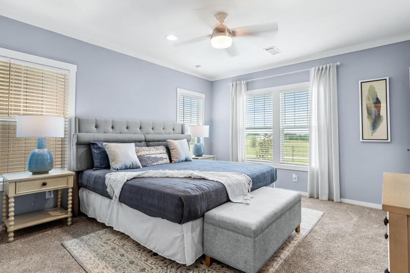
For overall 2024 home design and decor trends, light blues have been popular in cabinetry, tiles and, of course, as the paint choice for a room refresh. Sherwin-Williams’s 2024 Color of the Year, “Upward,” is a great choice for a bright, airy shade. It can pair with a range of hues, including earth tones, dark blacks and blues or soft creams. And it’s just as perfect for a farmhouse or sleek, modern kitchen as it is for your bedroom or bathroom. Other beautiful blues named colors of this year are “Blue Nova” by Benjamin Moore and “Renew Blue” by Valspar.
But blue isn’t the only color that can really liven up a room. Other standouts include:
- Sherwin-Williams Persimmon HGSW6339
- Benjamin Moore Hazy Lilac 2116-40
- Dunn-Edwards Chartreuse DEA123
Deeper Shades
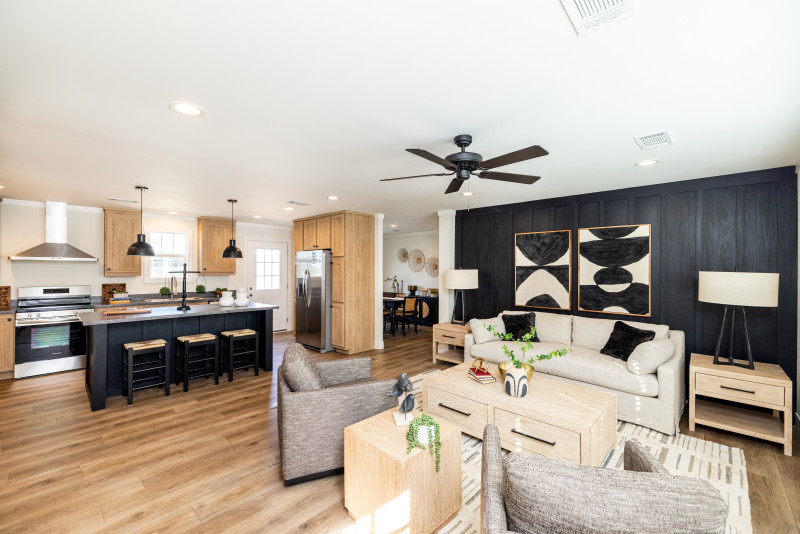
If you favor a darker palette, we recommend soft blacks, shadowy reds and rich greens. These colors will help define a space and pair well with brass hardware and natural woods. You can use them to add drama or a moody vibe and the deeper colors also create a sense of intimacy that would be perfect for the dining room, den or a home office.
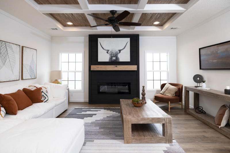
And if you’re worried about the color being overwhelming in a smaller space, you can always soften it with earth tones in fabrics, natural-finished furniture and accent. Or you can add a darker focal point in the brick of a fireplace or a kitchen island.
Here are some of this year’s notable darker colors to really make an impression:
- Behr Cracked Pepper PPU18-1
- Sherwin-Williams Dark Auburn SW 6034
- Benjamin Moore Regent Green 2136-20
Warm Neutrals
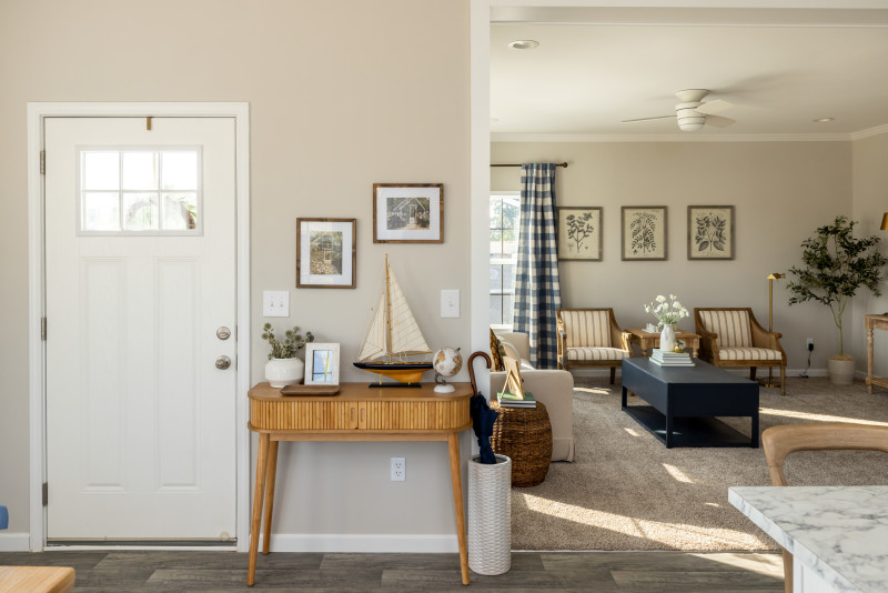
Moving away from starker grays and whites, the trend for neutrals is warmer and inviting colors. And that’s no surprise with the rise of quiet luxury along with nature-inspired decor for healthier living at home. Be on the lookout for browns, beiges and earth tones to add a subtle elegance that still feels homey. And don’t limit your color choice to just walls. Cabinetry and built-ins in a natural tone can elevate a room, too.
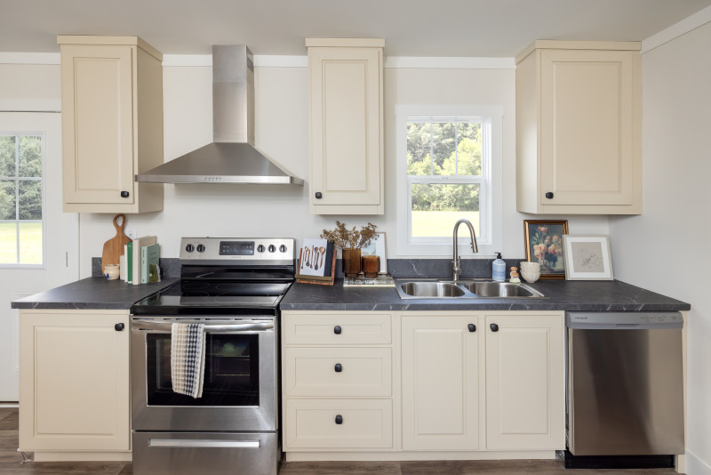
These colors will highlight other parts of your home’s decor, like quality-made furniture and textiles, quartz and marble countertops, and curated pieces of art. Neutrals are also good at reflecting natural light, so open those curtains and enjoy a welcoming, comfortable atmosphere.
Our feelings are definitely not neutral about these lovely colors:
Whether you choose to go with more classic shade or something more adventurous, a fresh coat of paint can give your home a whole new vibe. Pick out some samples for your next project or check out Clayton’s design inspiration on Pinterest. You can also head to the Home Features category on our Studio blog to see our favorite floor plans and highlighted home details like kitchen islands and shower options for even more inspiration.
Are you ready to find your dream home?
Start shopping now or find a home center in your area to learn more about Clayton Built® home options.By entering your email address, you agree to receive marketing emails from Clayton. Unsubscribe anytime.
© 1998-2025 Clayton.

